Elavon System Status Website Redesign
Project Overview
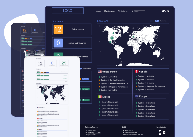
The Elavon System Status website monitors all Elavon products and processes over multiple locations and across countries. Its purpose is to display the status of deployed systems as well as repair statuses and reporting of new issues. During my internship with Elavon, I worked on redesigning the website’s UI to improve efficiency and usability after conducting a heuristic evaluation and performing usability testing.
Role: UI/UX Designer Timeline: Jun - Aug 2020
Tools Used: Figma, Procreate, Confluence
Heuristic Evaluation
This internship was largely a learning experience for me, and I began by conducting a heuristic evaluation of the current Elavon System Status website’s home page. There are 10 usability heuristics for UI Design:
1. Visibility of System Status
2. Match between System and Real World
3. User Control and Freedom
4. Consistency and Standards
5. Error Prevention
6. Recognition Rather than Recall
7. Flexibility and Efficiency of Use
8. Aesthetic and Minimalist Design
9. Help Users Recognize, Diagnose, and Recover from Errors
10. Help & Documentation

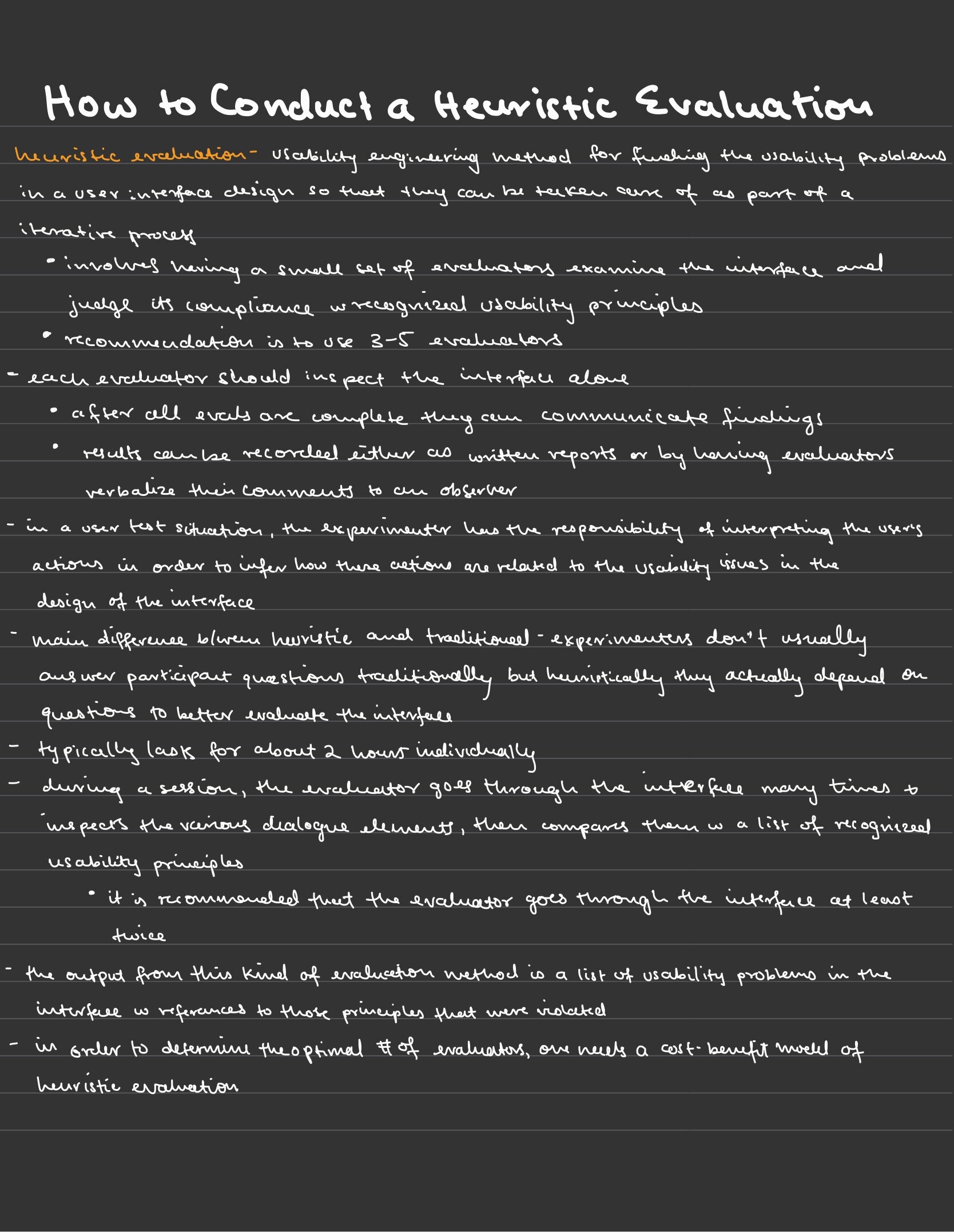
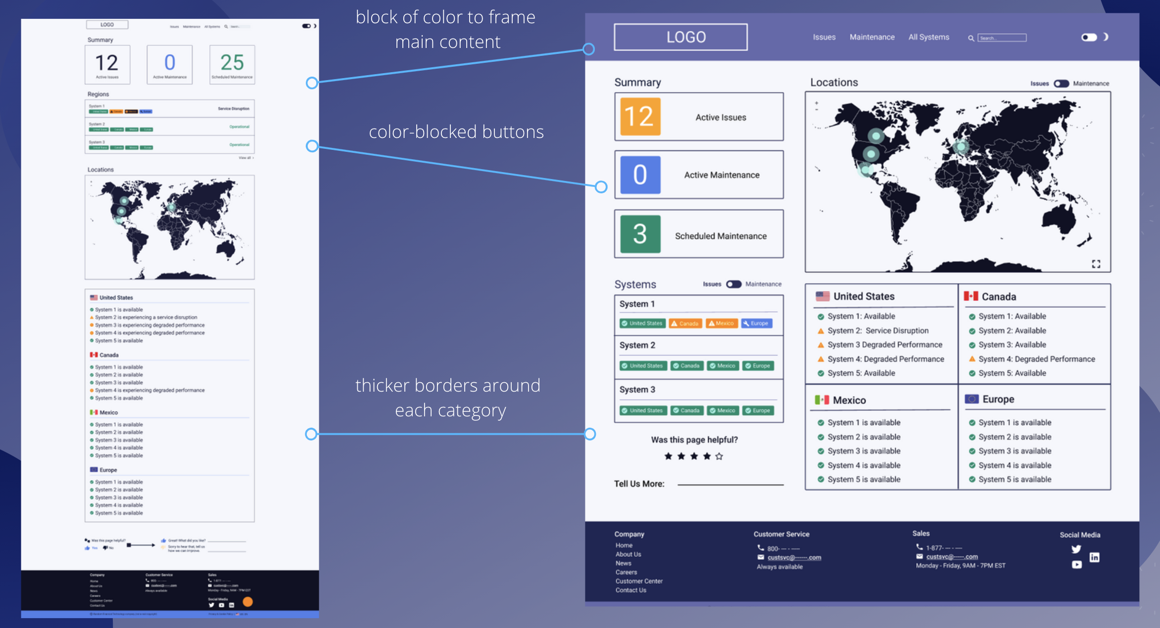
After completing the evaluation analyzing in both dark and light mode, I made conclusions that the finished portions of the site primarily violated 4 principles:
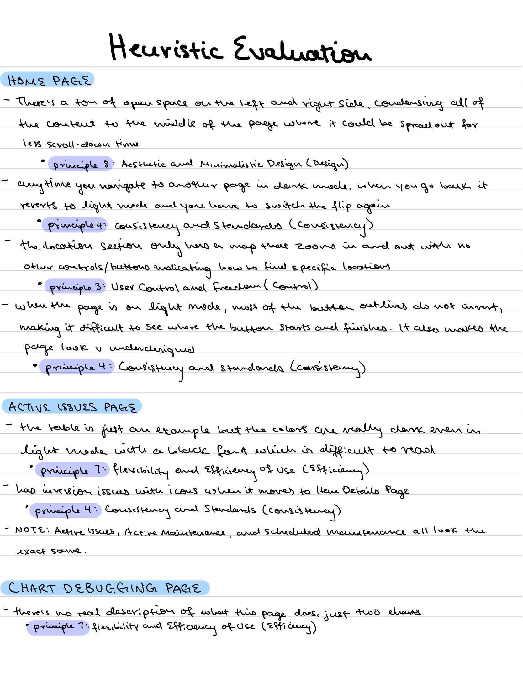
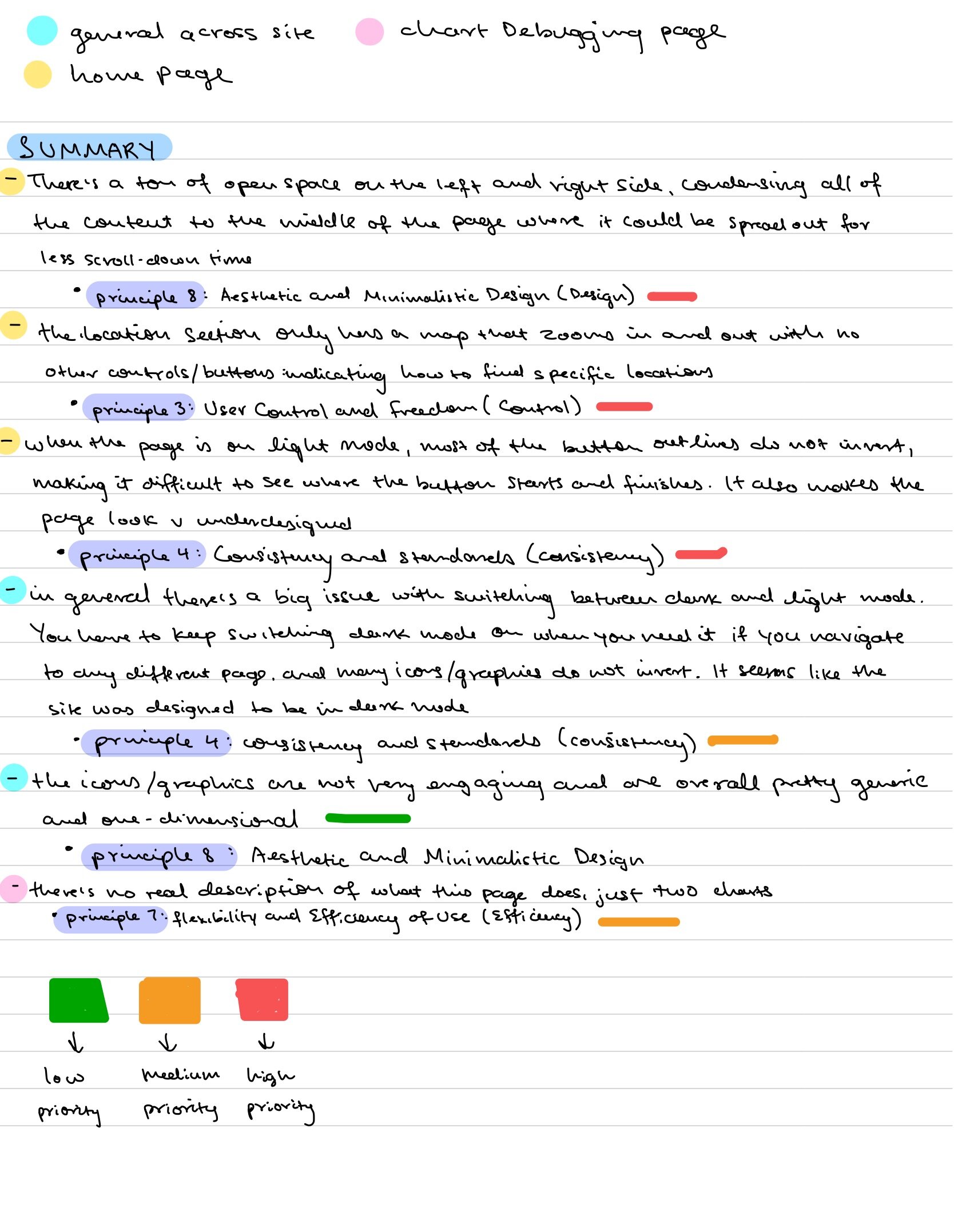
Principle 3 - User Control and Freedom
When the page is on light mode, most of the button outlines do not invert, making it difficult to see where the button starts and finishes. It also makes the page appear under-designed.
Principle 4 - Consistency and Standards
In general there is a big issue with switching between dark and light mode. You have to keep switching dark mode on when you need it if you navigate to any different page. It seems as if the site was designed primarily for dark mode and not equally for both.
Principle 7 - Flexibility and Efficiency of Use
There is no real description of what the chart debugging page does, it just lists two charts.
Principle 8 - Aesthetic and Minimalist Design
There’s an ample amount of open space on the left and right side of the home page, condensing all of the content to the middle of the page where it could be spread out for less scroll-down time.
The icons/graphics are not very engaging and are overall pretty generic and one-dimensional.
Using the Heuristic Evaluation, it became clear which sections needed the most restructuring, and I broke them down in order to begin creating focused user stories.

Elavon System Status Website Focus Areas^
User Research
Next, I used the platform provided by Elavon (usertesting.com) to do user research specifically attempting to answer my own theories of how the website could be improved, and after completion had 3 specific findings:

User Stories & Sketches
After identifying specific growth opportunities using the Heuristic Evaluation and User Research, I pinpointed two main user stories to design from:
1. As a user of the Elavon system Status Website, I want to be able to use dark and light mode interchangeably so that I can feel comfortable using the website any time of the day.
2. As an Elavon customer always pressed for time, I want to be able to see all of the important elements of the website quickly so I don't waste time.
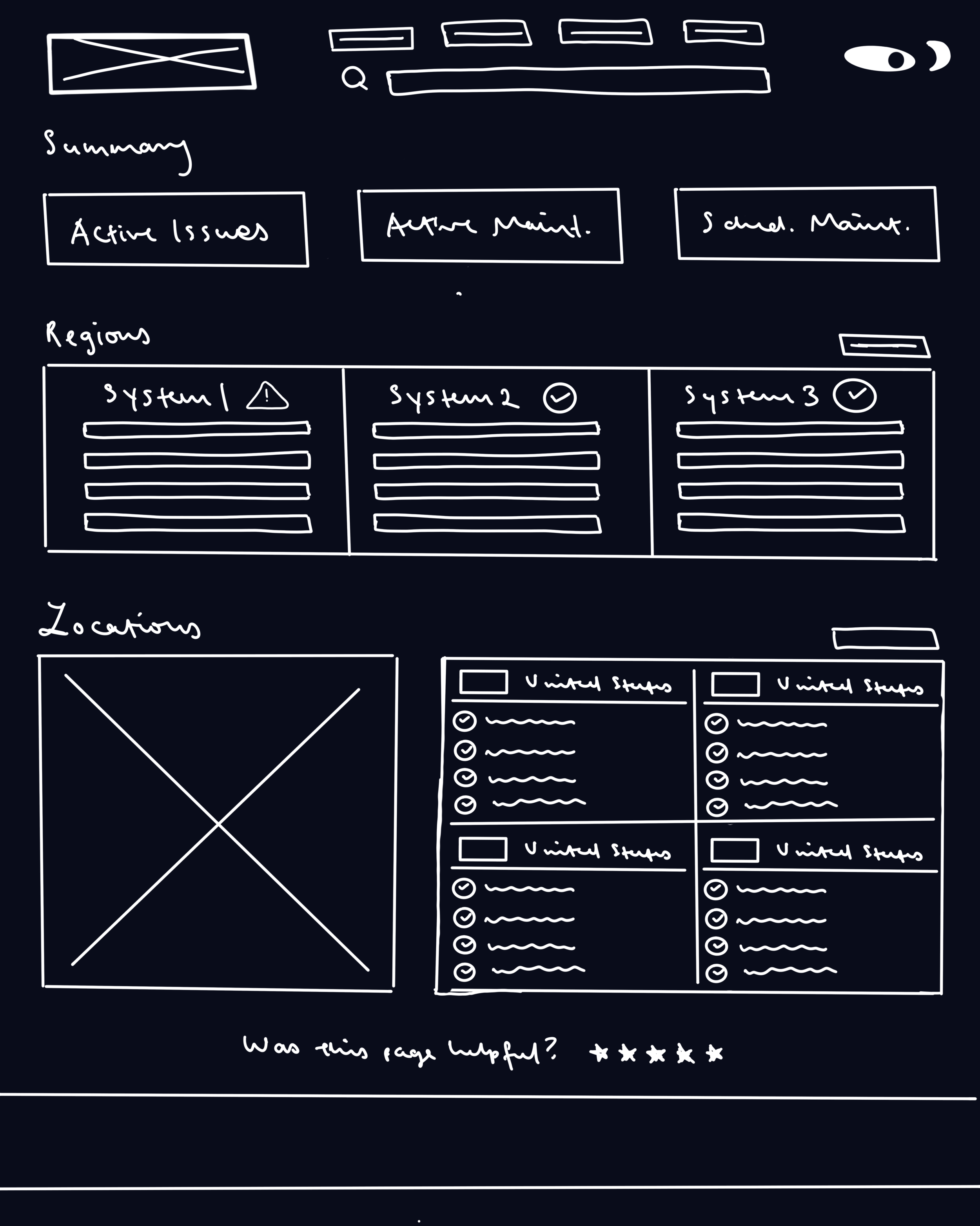
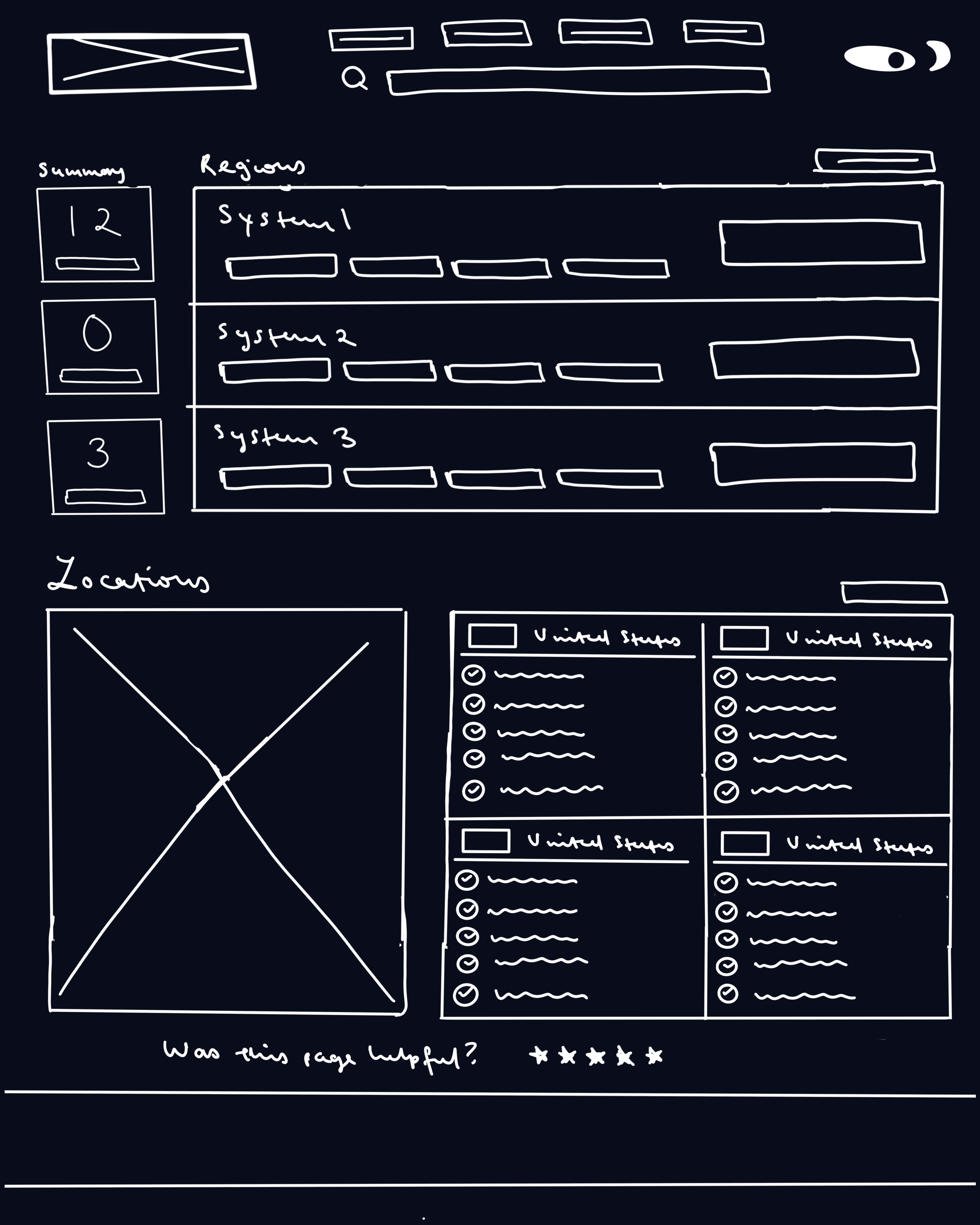
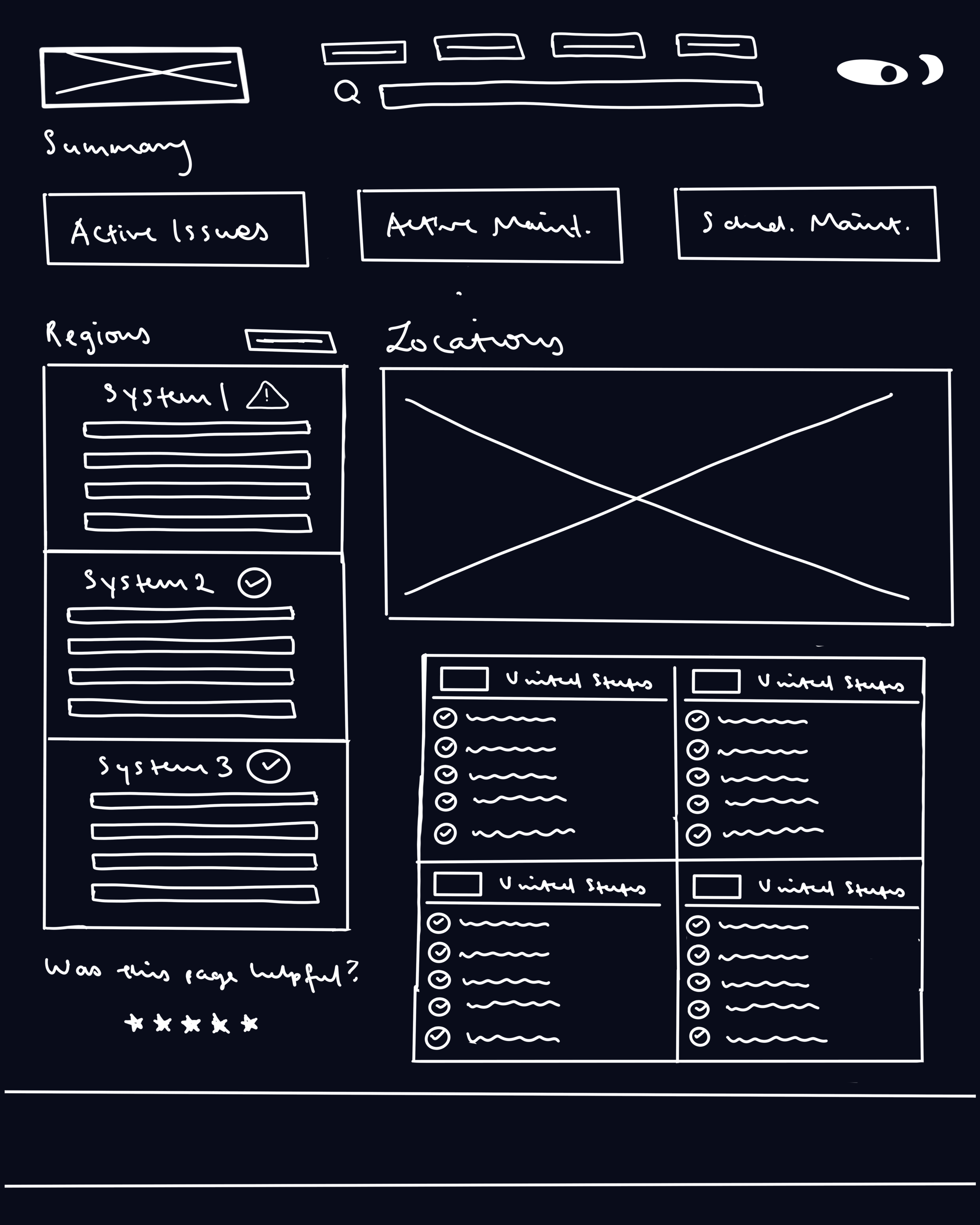
After this, I began low-fidelity sketches of ideas for a new home page, then chose one to continue with moving forward in the project:
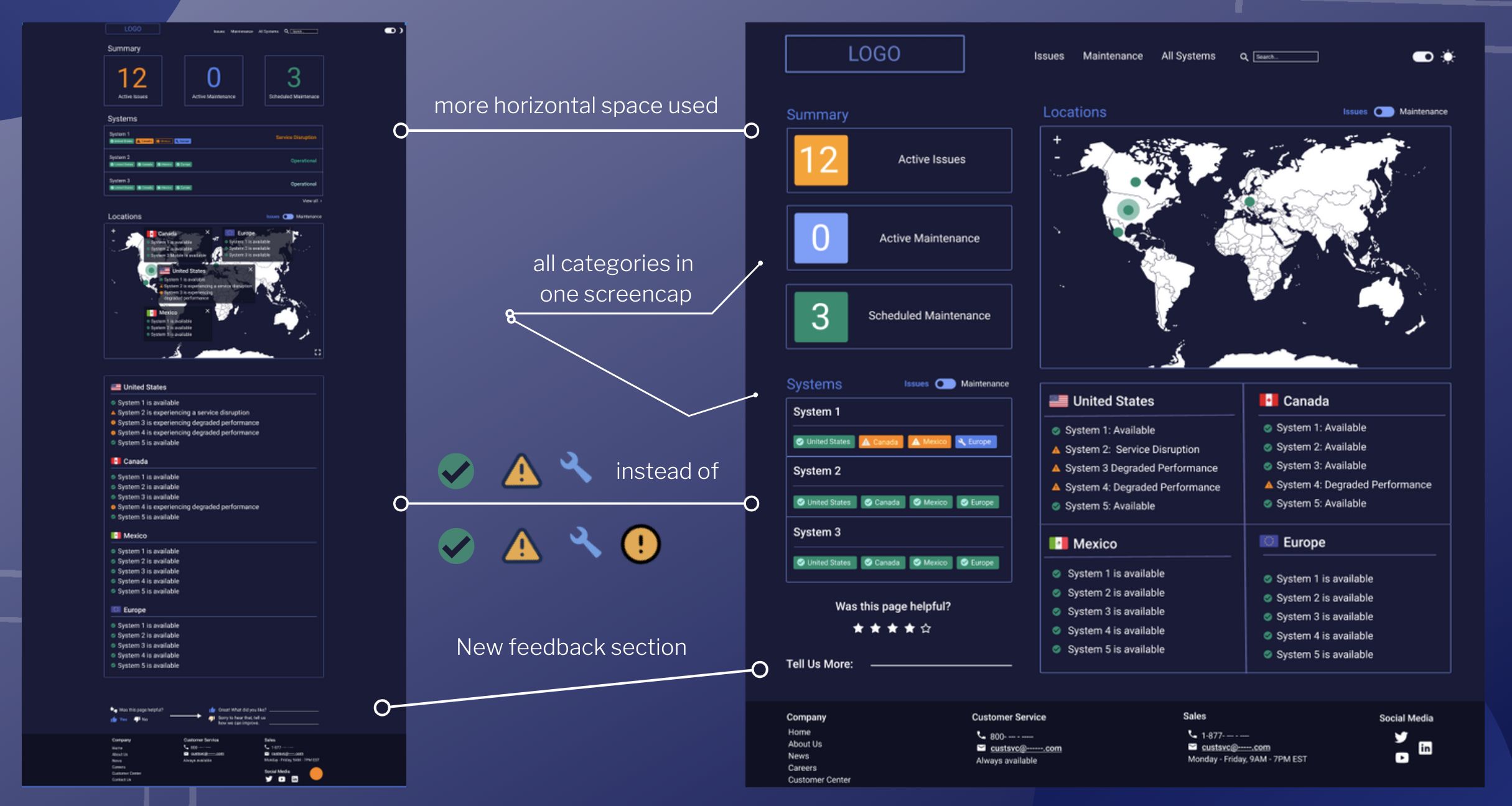
Interaction Design, Prototyping, & User Testing
Finally, I was ready to start prototyping! I used Figma to redesign the home page in dark and light mode, and deployed my prototype to a control group on usertesting.com which confirmed that my changes were received to be an improvement to the older version of the website!
Developer Handoff & Conclusion
I worked with the developer of the site Bryce Watson to discuss how changes could be implemented, as well as how react native would be used to deploy these changes. Working with Bryce was especially helpful because he exposed me to so many new technologies, trends, and platforms I didn’t have much knowledge on prior to this internship.
Key Takeaways:
learned Figma, which is the industry standard for interaction design/prototyping
learned the full iterative design process and now feel confident to tackle an independent case study
networked with both UX designers and developers through Robbie, Frank, and Wade
What Could be Done Differently?
would have given more time and attention to accessiblity rules
If we had more time/weren't remote I wish I could have worked alongside Bryce and learned how to develop the actual site
would have worked on examining more of the website/designing more if I had the time!